Clearly, it appears that the Southwest designers know what it takes to create a great advertisement. Their use of the basic attributes of good design shine through in this simple, yet effective, ad. We see the use of proximity, alignment, color, contrast, and repetition, everything that makes it pleasing to look at.

Proximity
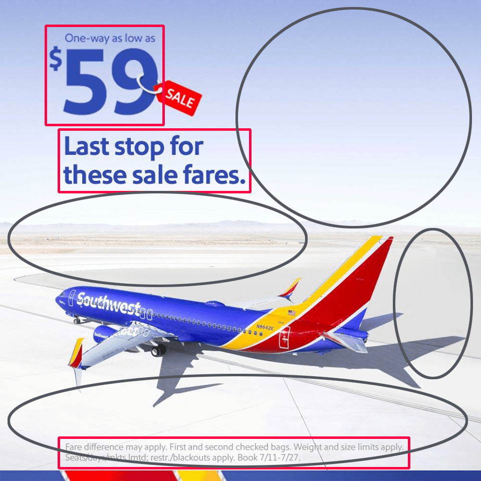
The simplicity of the ad is apparent with their concise use of text. The pricing information is grouped together with the tag-line slightly separated from the numbers, and the less important information is left at the bottom hidden in the foreground of the landscape. The close proximity of each group of text creates enough negative white space for the ad to breathe, allowing the reader’s eyes to relax and take it in without feeling overwhelmed.

Alignment
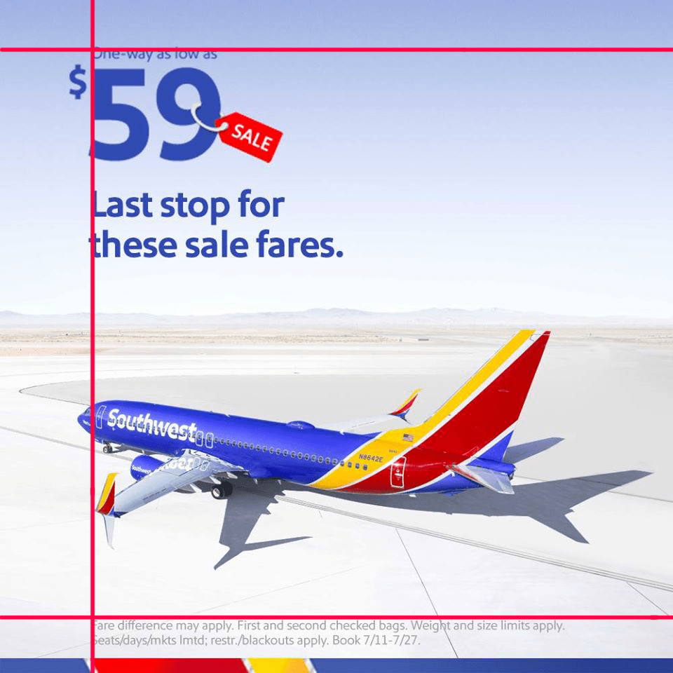
A strong left alignment is used with the main text as well as the less important text hidden in the bottom of the ad. Not only is the text aligned but also the nose of the plane and the tip of the left wing is in line with the invisible line created between the text. The first white line break in the band of color at the bottom of the ad also meets the left line of alignment.

Color
Southwest Airlines is not afraid to use color. Their planes are all painted using the basic primary colors in their saturated purest form. This feature alone makes them standout among all of the other airlines. By using the blue color of the plane in the text it gives balance to the ad. The conditions of the sale are hidden with gray text on a light background.

Repetition
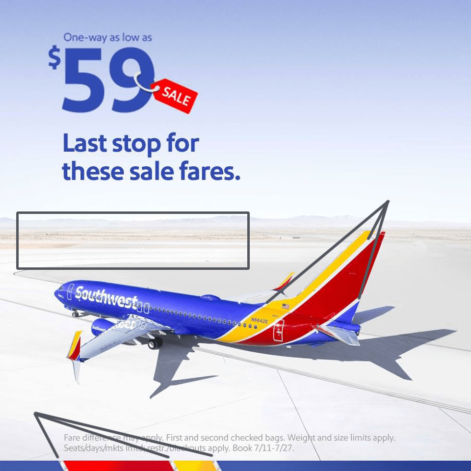
As simple as the ad appears, there is a lot of repetition to be found. Between the bands of color on the tail of the plane they use a white line to separate each band. The line of the plane follows the line of the runway. Even the landscape in the background shows repetition as you can see the striations of color between the mountains, ground level, and the foreground. They also repeat the colors of the plane in the text, sale tag, and color band at the bottom of the ad. The location of the main areas of color work together creating three invisible triangles for visual harmony.

Contrast
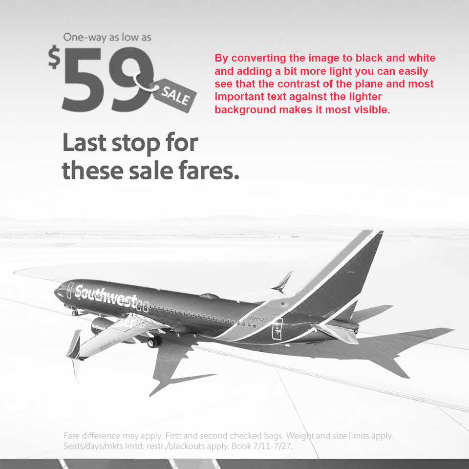
Contrast is used by focusing on the vibrance of the plane compared to the washed-out background of the landscape. Even the shadow of the plane appears to be exaggerated compared to the lighter shades of color on the ground. Even though the upper part of the ad is blue, it is light enough for the blue of the text to be easily read. The lack of contrast in the small text at the bottom shows that the information is less important.

Southwest earns an A+ for their use of each of the attributes of color, repetition, alignment, proximity, and contrast. They clearly know what it takes to get their message to the buyer effectively, and bring it all home in a first-class advertisement.