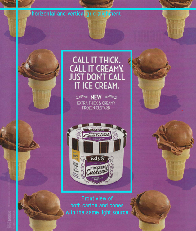
Edy’s Custard from the Nestle Corporation is my featured advertisement. The ad was found in a Sunset magazine from May 2015. The campaign was to encourage their audience to recognize that frozen custard is not merely ice cream. There is a difference, and they want you to believe that their custard is superior to ice cream.

DESIGN
The advertisement was kept simple, yet effective. As you can see, repetition is used a lot in the ad by using nine different chocolate malt cones to frame the carton of frozen custard and the text. Repetition is also used by using the same front view of the carton with a front view of the cones. You will notice that the cones are aligned in a type of grid both vertically and horizontally.

COLOR
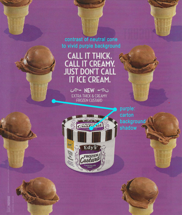
The purple found in the carton is also repeated as the background for the ad. The yellow complimentary color of the cones is a nice contrast to the background. The only change in the background is the shadow found near each cone. The carton and cones both appear to use the same light source casting the shadows in the same direction.

TYPOGRAPHY
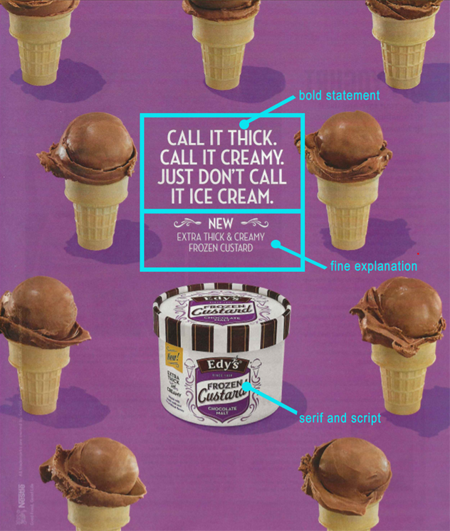
The typography of the ad is a simple sans-serif font which is in contrast to the serif and script fonts used on the carton. With the text being framed with the custard, there is no question as to where the focus of the ad is. The proximity of each section of text makes it clear that they are separate statements. The two sections are separated slightly by space. The tag line is a bolder type to get the main message across. The flourishes highlight the fact that it’s a new product, and the finer font tells the audience exactly what they are selling.

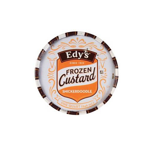
The new ad works well with the original ad by repeating the design style. The orange from the new carton of snickerdoodle custard is also used for the background. Instead of cones, nine custard bowls, but they still follow the same grid pattern. The view of the carton is from the top so the custard bowls are also a top view. A similar font was used to mimic the font used in the original ad creating another ad for the Edy’s campaign.


This is awesome! I really like how you laid everything out and the way you explained the parts of the ad. I think the illustrations are great as well! Thanks for posting and sharing!
LikeLike